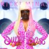
RickiMinaj Posted June 26, 2010 Report Share Posted June 26, 2010 [align=center] [/align]Hope you like. Everything's from scratch except for the text, which was made by a fusion of yorkville and some vector vines. Link to comment Share on other sites More sharing options...
-DG- Posted June 26, 2010 Report Share Posted June 26, 2010 The text is pure fail. I'd get rid of it and use a more modern Sans-Serif font of some sort and not attempting to "deck it out". The chains don't fit the vectoring of the balls, or whatever they're supposed to be. The shading for the chains are just ridiculous. Soften the bevels. Where the chains are connected need a "connector", usually half of a link welded, or, in this case, simply added, to the items the chains are linked to. Link to comment Share on other sites More sharing options...
RickiMinaj Posted June 26, 2010 Author Report Share Posted June 26, 2010 The text is pure fail. I'd get rid of it and use a more modern Sans-Serif font of some sort and not attempting to "deck it out". The chains don't fit the vectoring of the balls' date=' or whatever they're supposed to be. The shading for the chains are just ridiculous. Soften the bevels. Where the chains are connected need a "connector", usually half of a link welded, or, in this case, simply added, to the items the chains are linked to.[/quote'] Huh, thought the text would be a keeper. Well thanks for your advice. I'll be sure to take it into consideration. Link to comment Share on other sites More sharing options...
Guest JoshIcy Posted June 26, 2010 Report Share Posted June 26, 2010 The text is pure fail. I'd get rid of it and use a more modern Sans-Serif font of some sort and not attempting to "deck it out".She could have done far better with the connections' date=' but the font itself and the plants DO help set the mood. No you sir, are the one that fails.[/color'] The chains don't fit the vectoring of the balls, or whatever they're supposed to be.The only reason they don't fit, is because of the angle not allowing for the backside of the chains and the balls being rather in your face. They do fit, you just don't have eyes at all apparently. The shading for the chains are just ridiculous. Soften the bevels.It was supposed to feel like METAL, what would you have her do to retain that? If she did the style would be far too consistent and it not appear to be metal. Where the chains are connected need a "connector", usually half of a link welded, or, in this case, simply added, to the items the chains are linked to.Usually being the the keyword here. Response to you in blue. And I'd really change the color of the text Gphaku (not sure if I can call you by name on the board), it merges far too easily with the balls yea? I don't think you want that >_<. And maybe a small drop shadow to disconnect it from the board? Even if it's 1px. Link to comment Share on other sites More sharing options...
RickiMinaj Posted June 26, 2010 Author Report Share Posted June 26, 2010 And I'd really change the color of the text Gphaku (not sure if I can call you by name on the board)' date=' it merges far too easily with the balls yea? I don't think you want that >_<. And maybe a small drop shadow to disconnect it from the board? Even if it's 1px.[/quote'] You know you can call me by my real name on the forum right ^^Haha, i don't mind. oh and will try that and post the result. ^_^ Link to comment Share on other sites More sharing options...
chairman ali Posted June 26, 2010 Report Share Posted June 26, 2010 The text is pure fail. I'd get rid of it and use a more modern Sans-Serif font of some sort and not attempting to "deck it out".She could have done far better with the connections' date=' but the font itself and the plants DO help set the mood. No you sir, are the one that fails.[/color'] The chains don't fit the vectoring of the balls, or whatever they're supposed to be.The only reason they don't fit, is because of the angle not allowing for the backside of the chains and the balls being rather in your face. They do fit, you just don't have eyes at all apparently.The angle points are NOT the ONLY reason. The light source on them do not seem to fit. The shading for the chains are just ridiculous. Soften the bevels.It was supposed to feel like METAL, what would you have her do to retain that? If she did the style would be far too consistent and it not appear to be metal. Where the chains are connected need a "connector", usually half of a link welded, or, in this case, simply added, to the items the chains are linked to.Usually being the the keyword here.Actually it is true. If there wasn't a connector then there should be a hole supporting the idea of the chain attached to the spheres. Also, if you have used references then I wouldn't call it from scratch. Overall its not bad but could be more conceptual. Link to comment Share on other sites More sharing options...
RickiMinaj Posted June 26, 2010 Author Report Share Posted June 26, 2010 Also' date=' if you have used references then I wouldn't call it from scratch. Overall its not bad but could be more conceptual.[/quote'] No references =) Link to comment Share on other sites More sharing options...
Brendano Harns Posted June 26, 2010 Report Share Posted June 26, 2010 The first one is better IMO. The text blinds me on the second. ;D Link to comment Share on other sites More sharing options...
-DG- Posted June 26, 2010 Report Share Posted June 26, 2010 EDIT: Nevermind. Link to comment Share on other sites More sharing options...
RickiMinaj Posted June 26, 2010 Author Report Share Posted June 26, 2010 Oh dear god guys! It's just piece of work, sheesh. Not everyone's going to agree on it, adn I'm aware of that. Whats with the anger in the speech here. Lets all calm down. Now I appreciate your advice and will take it into consideration. Thanks for your time. ~ Ino Link to comment Share on other sites More sharing options...
Night Posted June 28, 2010 Report Share Posted June 28, 2010 The only part i like is the balls. (I <3 Balls) everything else is ass, including the text. Link to comment Share on other sites More sharing options...
RickiMinaj Posted June 28, 2010 Author Report Share Posted June 28, 2010 The only part i like is the balls. (I <3 Balls) Your signature also screams that...But thank you, i appreciate your commentary. Might I ask how I may improve it? Link to comment Share on other sites More sharing options...

Recommended Posts
Archived
This topic is now archived and is closed to further replies.