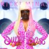
RickiMinaj Posted August 13, 2010 Report Share Posted August 13, 2010 I'm aware text is aweful >.< I need a suggestion on how to improve it. Any help maybe? I also need help on the breakaway portion of the show. I used a spaltter brush to see how it turned out, doesn't give me quite the right feeling. Help much? [spoiler=current] [spoiler=former] Link to comment Share on other sites More sharing options...
I-dreezyAFG Posted August 13, 2010 Report Share Posted August 13, 2010 the shoe sucks. the rest idk. if u want adidas still use the ts supernatural commander Link to comment Share on other sites More sharing options...
chairman ali Posted August 13, 2010 Report Share Posted August 13, 2010 The idea is pretty slick.The execution needs a lot more though. Its kind of "too" messy right now. You might wanna construct the splatters differently. Like go to Transform > Wrap. Or if you have CS5, Transform > Puppet wrap. And then play with their direction.The background could use some texture stocks. Perhaps on "Darken" or "Lighten".The Triangle is cool but the lighting on it is way off. Also, for the colours you might wanna use adobe.kuler. Link to comment Share on other sites More sharing options...
RickiMinaj Posted August 13, 2010 Author Report Share Posted August 13, 2010 The idea is pretty slick.The execution needs a lot more though. Its kind of "too" messy right now. You might wanna construct the splatters differently. Like go to Transform > Wrap. Or if you have CS5, Transform > Puppet wrap. And then play with their direction.The background could use some texture stocks. Perhaps on "Darken" or "Lighten".The Triangle is cool but the lighting on it is way off. Also, for the colours you might wanna use adobe.kuler.MUCH appreciated ^^ EDIT: added a new one :3 Link to comment Share on other sites More sharing options...
Guest Posted August 13, 2010 Report Share Posted August 13, 2010 Ken always beats me to things its not fair >:, oh wait we be brothers so we just read each others genus brains thats it yeahhhh do what ken suggested and if after you still need help i will. Link to comment Share on other sites More sharing options...
RickiMinaj Posted August 13, 2010 Author Report Share Posted August 13, 2010 Ken always beats me to things its not fair >:, oh wait we be brothers so we just read each others genus brains thats it yeahhhh do what ken suggested and if after you still need help i will. I did some modifications :3Now there's a new one, what's your oppinion on that? Link to comment Share on other sites More sharing options...
Guest Posted August 13, 2010 Report Share Posted August 13, 2010 Well I had to save it to see the whole thing (damn new ycm) The effects at the bottom of the shoe could be executed alot better and the colors don't really appeal to meYou might want to go with more colors that go with gold, even if it hurts your concept a bit it might help the appeal and such. Link to comment Share on other sites More sharing options...
chairman ali Posted August 13, 2010 Report Share Posted August 13, 2010 Maybe more colours adjustment layers on the splatters. they're a bit off. Maybe use CMYK.Also a good idea would be duplicating the triangle and adding it on other places. Larger, smaller, rotated, faded, blurred, motion blured, different colours, etc. :) Link to comment Share on other sites More sharing options...

Recommended Posts
Archived
This topic is now archived and is closed to further replies.