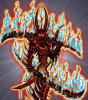
Anthony Lu'Steezy' Posted May 7, 2011 Report Share Posted May 7, 2011 okay so the pic isnt that great, but its just a test card to see how you guys like the new card layout im hoping this one is a winner! let me know what you think! any feedback helps! thanks! [IMG]http://i510.photobucket.com/albums/s344/Anthonyzilla24/darkmonsterfin-1.jpg[/IMG] Link to comment Share on other sites More sharing options...
Garthfunkle Vii Backwards Posted May 7, 2011 Report Share Posted May 7, 2011 please add lore this monster effect is bland and not unquie ive seen stuff like that before the effect does not "wow me" you seem good at card templates as you allready know i might need a new card template for the elite monsters that ive made Link to comment Share on other sites More sharing options...
D.A._Sakuyamon Posted May 7, 2011 Report Share Posted May 7, 2011 [quote name='Anthony Lu'Steezy'' timestamp='1304757161' post='5192900'] okay so the pic isnt that great, but its just a test card to see how you guys like the new card layout im hoping this one is a winner! let me know what you think! any feedback helps! thanks! [img]http://i510.photobucket.com/albums/s344/Anthonyzilla24/darkmonsterfin-1.jpg[/img] [/quote] Design looks tons better then old one. More organized and you can tell what level it is lol. Lore not needed. The effect is fine the way it is. Aside from the full caps i don't see any grammar errors. 7.4331067/10 Link to comment Share on other sites More sharing options...
Ярополк Пономарёв Posted May 7, 2011 Report Share Posted May 7, 2011 Suggestions for template: [list][*]Small caps not all caps.[*]Use original attribute design.[*]Remove SYNCHRO: and EFFECT: signs from the effect box.[/list] Other than that I like. Link to comment Share on other sites More sharing options...
Mecha Love Posted May 7, 2011 Report Share Posted May 7, 2011 Is that template available for GIMP or MSE? Wouldn't mind using it. Otherwise; everything said above. Link to comment Share on other sites More sharing options...
Cody Frost Posted May 7, 2011 Report Share Posted May 7, 2011 [quote name='Anthony Lu'Steezy'' timestamp='1304757161' post='5192900'] okay so the pic isnt that great, but its just a test card to see how you guys like the new card layout im hoping this one is a winner! let me know what you think! any feedback helps! thanks! [IMG]http://i510.photobucket.com/albums/s344/Anthonyzilla24/darkmonsterfin-1.jpg[/IMG] [/quote] I rather like the card design. It intrigues me greatly. The only two things I would probably change would be the "DARK" attribute by keeping it the same (the yugioh DARK attribute) and the "Star level". I like where the star level is indicated, but maybe the number should be behind a regular yugioh star, but maybe that's just me. The rest looks fantastic and quite eye appealing! the card itself is alright. Pretty decent. Rate for template: 9/10 Rate for card: 8.2 Overall rate: 8.6/10 Link to comment Share on other sites More sharing options...
Anthony Lu'Steezy' Posted May 7, 2011 Author Report Share Posted May 7, 2011 haha honestly, the monster an effect i made up on the spot in 2 seconds. it was just to test the template haha and ive been trying to find a decent font that looks sorta like this one cuz i reallly like it, but this one only comes in all caps :/ and yes, i think i will use the old element... ill test it out haha and i designed this in photoshop and gimp, i had to use both.... but i wont be making it public :/thanks ton those guys huge help as always! Link to comment Share on other sites More sharing options...
Zextra Posted May 7, 2011 Report Share Posted May 7, 2011 Not bad at all. First of all, I would like to say to those who think "creativity" is everything, it's not: Cards like Dark Armed Dragon, Mirror Force, Bottomless Trap Hole, Dimension Prison, and Book of Moon are wonderful cards, but are they creative? Obviously not. Cards are supposed to be made for their playability, not creativity, as that shows the difference between a "good card" and an unplayable card. Anyways, this card's effect is perfectly fine as it is, though it's a bit UP'ed in my opinion - I'd rather use other Generic Synchros such as Stardust Dragon and Colossal Fighter over this, but still, it's by no means bad. It has a solid self-target effect with a little bonus at the end... The template is nice - all I have to say are the things already said above. Link to comment Share on other sites More sharing options...
Anthony Lu'Steezy' Posted May 7, 2011 Author Report Share Posted May 7, 2011 yeah the card is alittle Op'd haha it has too high of strength in terms of its effect but this is in no way a permanent monster, just a test card.... im gonna change the attribute picture and font.... but i think thats about it ... dont wanna make it too much like the old card, gotta keep things retro haha Link to comment Share on other sites More sharing options...
Zextra Posted May 7, 2011 Report Share Posted May 7, 2011 [quote name='Anthony Lu'Steezy'' timestamp='1304796371' post='5193913'] yeah the card is alittle Op'd haha it has too high of strength in terms of its effect but this is in no way a permanent monster, just a test card.... im gonna change the attribute picture and font.... but i think thats about it ... dont wanna make it too much like the old card, gotta keep things retro haha [/quote] I didn't say it was OP'ed, I said it was UP'ed - as in underpowered if not perfectly balanced It's not a bad card at all (and it's rather good if you made it up in 2 seconds ); it has a good, basic idea, supported with another additional effect; overall, it's really nice. Link to comment Share on other sites More sharing options...
Anthony Lu'Steezy' Posted May 7, 2011 Author Report Share Posted May 7, 2011 oh thank you i felt it was OP'd cuz it is the main target but still has a higher ATK haha i think i might just keep the template the same.... i think that its just new and once you get used to it, it wont be as bad i was setting out to revamp the card look, and if i just chang it back to having old card stuff and have it set up kind of the same, then im just stepping away from my original intention... im gonna make a whole set with this temp. and post it and then ill see what everyone thinks :0 id really appreciate it if you all took a look at it when im done and if its still not like, then ill change! Link to comment Share on other sites More sharing options...
Ieyasu Tokugawa Posted May 7, 2011 Report Share Posted May 7, 2011 [quote name='Herman The German' timestamp='1304779787' post='5193278'] this monster effect is bland and not unquie ive seen stuff like that before the effect does not "wow me" [/quote] [spoiler=How's this for a creative effect?] [img]http://images.wikia.com/yugioh/images/c/c7/PotofGreedSD4-EN-C-1E.jpg[/img] [/spoiler] Can't really say anything that hasn't been said. It's not OP'd because there aren't any high tier mono-fiend decks out there, and even then this easily falls to destruction effects. I'm not judging the template because I'm not a graphic designer >_> Link to comment Share on other sites More sharing options...
Anthony Lu'Steezy' Posted May 7, 2011 Author Report Share Posted May 7, 2011 oh come on, just tell me if it sucks or not? hahha Link to comment Share on other sites More sharing options...
Ieyasu Tokugawa Posted May 7, 2011 Report Share Posted May 7, 2011 Well like said earlier the attribute symbol is just meh. You can try a new one or just use the current ones. I would've liked to see some stars too Link to comment Share on other sites More sharing options...
Anthony Lu'Steezy' Posted May 7, 2011 Author Report Share Posted May 7, 2011 see, that wasnt hard! this all helps! haha but like i said, im gonna make a complete set and then see how that is rated if badly, then ill make some suggested changes Link to comment Share on other sites More sharing options...
-Blue- Posted May 7, 2011 Report Share Posted May 7, 2011 I like the new layout bro. Its really organized and I would buy these cards any day! Link to comment Share on other sites More sharing options...
Cartridge813 Posted May 7, 2011 Report Share Posted May 7, 2011 What's the little "1st" for? otherwise I like to layout, a little striking at first, but one can get used to it The actual monster, however, could use a little work I'd like to see how you would make a trap and spell though Link to comment Share on other sites More sharing options...
Anthony Lu'Steezy' Posted May 7, 2011 Author Report Share Posted May 7, 2011 the 1st is first edition and if it has a gold L it stands for limited.... yeah that pic was just to show off the card real fast, its not one of my actual monsters haha yeah ill have a couple spells and traps in my final set that im working on to showcase the full potential of my new design props on being the first person to ask both of those questions hahaha Link to comment Share on other sites More sharing options...
Anthony Lu'Steezy' Posted May 8, 2011 Author Report Share Posted May 8, 2011 i need more opinions! please? haha Link to comment Share on other sites More sharing options...
Anthony Lu'Steezy' Posted May 9, 2011 Author Report Share Posted May 9, 2011 bump Link to comment Share on other sites More sharing options...

Recommended Posts
Archived
This topic is now archived and is closed to further replies.