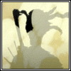
.Requiem Posted May 27, 2008 Report Share Posted May 27, 2008 This is a new banner I Been working on so please rate: First one: Second: Link to comment Share on other sites More sharing options...
Bloodrun Posted May 27, 2008 Report Share Posted May 27, 2008 the sparks needs to be brighter... Link to comment Share on other sites More sharing options...
.Requiem Posted May 27, 2008 Author Report Share Posted May 27, 2008 Which one is better? Also its suppose to been the chidori. Link to comment Share on other sites More sharing options...
Bloodrun Posted May 27, 2008 Report Share Posted May 27, 2008 Which one is better? Also its suppose to been the chidori. the second one ^_^ Link to comment Share on other sites More sharing options...
Seth Posted May 27, 2008 Report Share Posted May 27, 2008 They're pretty much the smae except the second one is reversed and has lighter text. Link to comment Share on other sites More sharing options...
Bloodrun Posted May 27, 2008 Report Share Posted May 27, 2008 They're pretty much the smae except the second one is reversed and has lighter text. yes they are but sense the second one is the lightestit looks betterthe spark still needs to be more bright >.< Link to comment Share on other sites More sharing options...
Sbamber Posted May 27, 2008 Report Share Posted May 27, 2008 I like the first one better, but I would make it a tad brighter, try that. Link to comment Share on other sites More sharing options...
RestLess-BoTics Posted May 28, 2008 Report Share Posted May 28, 2008 Yeah, I would also recommend to make Sasuke's chidori, slightly brighter, and I would also work on the text on the banner. Overall, great effort! -Glasstin Link to comment Share on other sites More sharing options...

Recommended Posts
Archived
This topic is now archived and is closed to further replies.