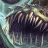
Yogg-Saron Posted July 30, 2008 Report Share Posted July 30, 2008 [align=center]Card art by me. Enjoy and comment![/align] Link to comment Share on other sites More sharing options...
Silencerleader Posted July 30, 2008 Report Share Posted July 30, 2008 The effect is not so bad for the "Alien Decks"...I used to run it...not really awesome.The pic bothers me...IDK. Not really good. Expected a better pic from you. *sigh* Link to comment Share on other sites More sharing options...
Yogg-Saron Posted July 30, 2008 Author Report Share Posted July 30, 2008 I have to agree about the picture. Though compared to the render it looks well done. Link to comment Share on other sites More sharing options...
╬「Selatcia」╬ Posted July 30, 2008 Report Share Posted July 30, 2008 A good help for Alien Decks. I like it.I have to agree with the pic being better though.8.5/10 Link to comment Share on other sites More sharing options...
Yogg-Saron Posted July 30, 2008 Author Report Share Posted July 30, 2008 Remastered the pic. I think it looks much much better than before. Link to comment Share on other sites More sharing options...
Silencerleader Posted July 30, 2008 Report Share Posted July 30, 2008 Kind of better but not really satisfying.The line 2/3 down the card is bugging me X_XIt's a line there that seems like a lettering piece but isn't. Yeah...I guess it'll have to do for now. -_- Link to comment Share on other sites More sharing options...
Yogg-Saron Posted July 30, 2008 Author Report Share Posted July 30, 2008 It is a lens flare effect. See the hardly visible line going through the head in the same direction? Thats from lens flare to. It is more realistic, as that would happen in real life. Link to comment Share on other sites More sharing options...
Silencerleader Posted July 30, 2008 Report Share Posted July 30, 2008 It is a lens flare effect. See the hardly visible line going through the head in the same direction? Thats from lens flare to. It is more realistic' date=' as that would happen in real life.[/quote'] Common Sense.I meant that it seemed like one.*sigh*Better than your last ;) Link to comment Share on other sites More sharing options...
Guest Star Posted July 30, 2008 Report Share Posted July 30, 2008 Basic card is basic. Nice try though. It's not bad, it's just not good either, lol. 6/10 Link to comment Share on other sites More sharing options...
Void Old Posted July 30, 2008 Report Share Posted July 30, 2008 I like it a lot. No wording errors I can see, and the picture's really nice. Although the render's a little fuzzy around the head. Link to comment Share on other sites More sharing options...
Yogg-Saron Posted July 30, 2008 Author Report Share Posted July 30, 2008 Thats just a grain texture. Like how it shows up kind of grainy when you scan a card. Thanks for the comments though! And I can't believe no OCG errors. Link to comment Share on other sites More sharing options...
Void Old Posted July 30, 2008 Report Share Posted July 30, 2008 Oh, actually, now that I look harder, Cards after Spell and Trap needs a capital c. ^_^ Link to comment Share on other sites More sharing options...
Silencerleader Posted July 30, 2008 Report Share Posted July 30, 2008 Cap cards.Spell and Trap Cards. Link to comment Share on other sites More sharing options...
Yogg-Saron Posted July 30, 2008 Author Report Share Posted July 30, 2008 Fix'd. Thanks guys. Link to comment Share on other sites More sharing options...
Spiff! Posted July 30, 2008 Report Share Posted July 30, 2008 nice card,but i dun liek the background.its cool,and complicated,and probz took ages to do,but i dun like it.nice card though. Link to comment Share on other sites More sharing options...
Yogg-Saron Posted July 30, 2008 Author Report Share Posted July 30, 2008 Well, thanks! Link to comment Share on other sites More sharing options...

Recommended Posts
Archived
This topic is now archived and is closed to further replies.