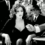
Catman25 Posted January 30, 2009 Report Share Posted January 30, 2009 Yeah, I know I'm not that great-a sig maker, but here we go. Credit to http://redheadstock.deviantart.com/journal/12379986/ for brushes. *Braces self for the harsh comments* Link to comment Share on other sites More sharing options...
~Shore Posted January 30, 2009 Report Share Posted January 30, 2009 is that multiple stocks/renders in the bg? they add to it a lot since otherwise the BG would just be a gradient. try using a little more blending for the BGs. I really like the background renders though, or are those the brushes?pretty good Link to comment Share on other sites More sharing options...
Zaca Posted January 30, 2009 Report Share Posted January 30, 2009 Height is to low. To plain. Link to comment Share on other sites More sharing options...
Catman25 Posted January 30, 2009 Author Report Share Posted January 30, 2009 @ZenQued The background renders are brushes. Pretty sweet. =) @Zaca, OK, you're an excellent sig maker, so i will follow your advice. Link to comment Share on other sites More sharing options...
Imperial Blaze Posted January 30, 2009 Report Share Posted January 30, 2009 Pretty good but it's too small and too simple. Link to comment Share on other sites More sharing options...
Mazerrick Posted January 30, 2009 Report Share Posted January 30, 2009 it's good but its a litte small and why didnt you add text? please dont think its bad if i made a sig and you looked at it you would give me a 0/10 Link to comment Share on other sites More sharing options...
Catman25 Posted January 30, 2009 Author Report Share Posted January 30, 2009 ^ I'm sure you wouldn't get a 0/10. That's really harsh. ;) Link to comment Share on other sites More sharing options...

Recommended Posts
Archived
This topic is now archived and is closed to further replies.