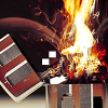
~Shore Posted June 21, 2009 Report Share Posted June 21, 2009 [align=center]I originally made this exclusively for my PSD pack, where I made it a promotional part of the pack designed to start people's interest. Now that the pack has been out for a while I've decided to release the png form for cnc.This particular piece went through a lot of conceptual changes. I first intended for it to be almost half black with text, and the face cut off by the black, with the text reading "Unknown Light". Then I removed the block and it looked better but since I had not edited the covered side it looked messy. Then I cut the reverse mirror thing and got this final copy. The erasing/blend between the faces has a noticeable and annoying error I should fix. [/align] Link to comment Share on other sites More sharing options...
~Shore Posted June 21, 2009 Author Report Share Posted June 21, 2009 bumpin it up Link to comment Share on other sites More sharing options...
Prada Posted June 21, 2009 Report Share Posted June 21, 2009 I love this concept. I really do. You have some depth issues with this tag, though. It doesn't seem flow is totally needed with this concept and style, but it might help. I just wouldn't over do it. Definitly a good, epic lighting style would help a bit. Maybe it's just me. Yes, the blend in the faces needs work. I like this, though. Very creative, IMO. Link to comment Share on other sites More sharing options...
~Shore Posted June 21, 2009 Author Report Share Posted June 21, 2009 Thanks, and thnx for the help. I'll see if I can work up a v2. Link to comment Share on other sites More sharing options...

Recommended Posts
Archived
This topic is now archived and is closed to further replies.