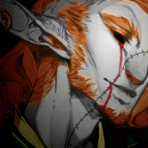
Thar Posted September 29, 2011 Report Share Posted September 29, 2011 I'm still getting used to GIMP. Giygas from Earthbound has grasped my interest and I tried making a sig based on new stuff that I learned for making them. I couldn't get the lighting and blending effects to work together, so I tried adjusting the hues and contrast to make it look better, yet I'm not sure if it improved it's appearance or just made it look even crappier. Nonetheless, here it is: [IMG]http://i.imgur.com/Z6nQc.png[/IMG] Criticize away, brethren. Link to comment Share on other sites More sharing options...
Simping For Hina Posted September 30, 2011 Report Share Posted September 30, 2011 For blending, spam GMaps. Lighting is a brushes work, but sometimes a simple gradient in an oval shape does the work. Get rid of the text now. What about the render? Everything is TOO blended it, I guess. Get rid of the borders, try different colors that compliment red. What is the focal of this thing? Link to comment Share on other sites More sharing options...

Recommended Posts
Archived
This topic is now archived and is closed to further replies.